
Just one story for our payers users.
We redesigned our landing page to showcase our key value propositions and app essential features.
Context
-
-
Users seeking information about Mercado Pago had to navigate through multiple homepages to understand the product. This fragmented experience made it difficult to grasp the value proposition.
These landings were divided into several features, and the information provided was more vendor-oriented, which resulted in more doubts about how to fund the account for payer users.

Objectives
-
-
First /
Tell a unified story aimed at payer users through a single landing page that centralizes and prioritizes the most important features while communicating Mercado Pago's value proposition.
Second /
Increase metrics such as monthly active payers, transactions value and downloads.
Benchmarking
-
We conducted an analysis of direct and indirect competitors, including banks and other fintech companies like Revolut, Paypal, NuBank, NaranjaX, Santander
Our analysis focused on their homepages and service offerings. We gathered information about value propositions, key features, presentation hierarchies, most important CTAs and overall homepage structure. Based on this analysis, we evaluated each company's products on a percentage scale to determine whether they functioned primarily as banks, digital wallets, or a hybrid of both.
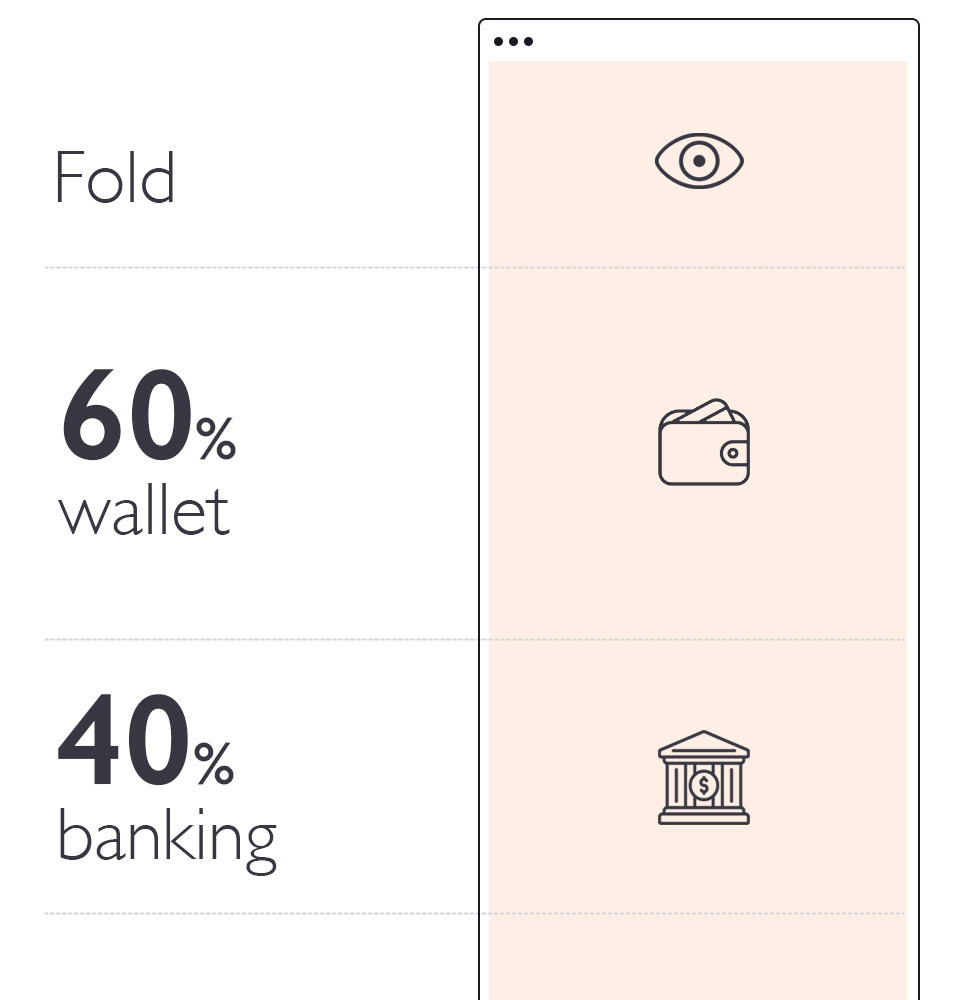
Our Story Focus
-
We structured our narrative with a 60% wallet and 40% banking emphasis.
For wallet features, we highlight QR payments as our primary payment method, along with the ability to pay utility bills and add funds to transportation cards.
For banking features, we emphasize the ability to add cash to accounts for use through the app and the Mercado Pago card as a complement .
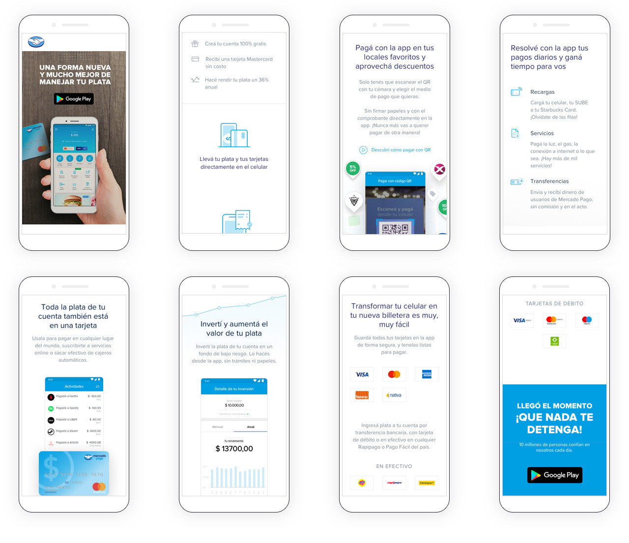
We organized feature groups by hierarchy, arranging them in order of importance from top to bottom
The fold /
This is the most crucial section—it's the user's first impression and what you offer here is vital for encouraging them to scroll down. We aimed to present the product in an appealing way, clearly explain what Mercado Pago is, and emphasize how the app serves as the main tool for users.
The fold must include a CTA—in this case, the app download button—along with the value proposition.
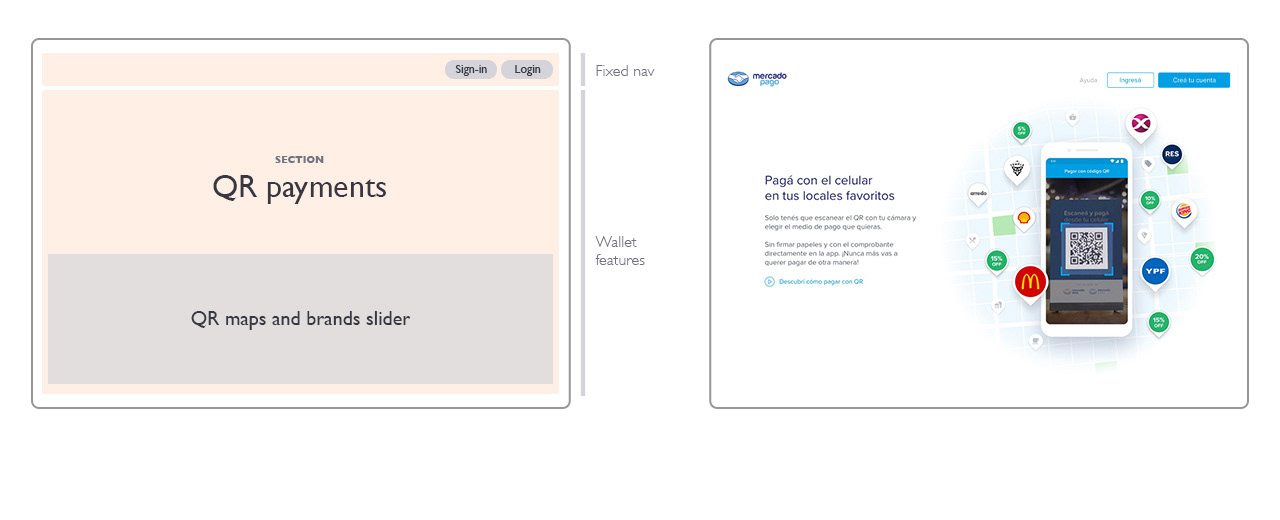
The navigation bar was fixed and contextual, designed for two distinct user types:
- Active users who need quick access to their accounts through the login button
- New users seeking information who benefit from the prominent app download button
A full-width image creates visual impact, accompanied by a promotional claim and value propositions organised in columns.

First Section: QR payments /
QR code payments are our highest-priority feature for payer users, serving as their primary payment method.
We strategically leveraged well-known merchant logos and promotional discounts to showcase where users can pay. This made QR payments a natural choice for the first scrollable section.
Key features to highlight include wide merchant coverage, promotional discounts, quick transactions, ease of use, and the flexibility to pay using any payment method through QR.
Second Section: Payments /
We grouped important wallet-related services for users into three categories:
‣ Transportation card recharges
‣ Public services payments
‣ Money transfers
‣ Public services payments
‣ Money transfers
Our goal was to demonstrate how users can centralize their daily payments quickly and easily.
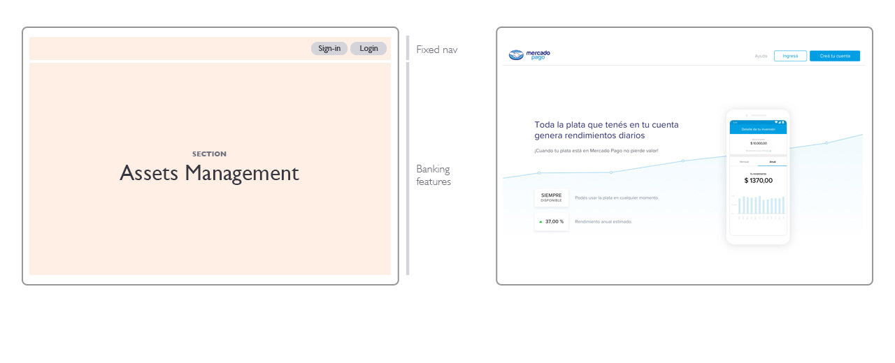
Third Section: Assets Management /
Another key feature is the ability to invest money within the ecosystem to earn returns. This is a complex concept that many people are unfamiliar with, as they typically associate investments with fixed-term deposits and locked funds.
We emphasize that users can grow their money while maintaining access to it for spending.
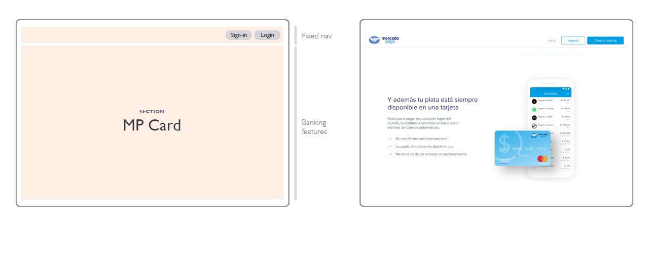
Fouth Section: MP CARD /
We have an international card that can be used for payments and cash withdrawals.
The goal is to complete the money usage cycle by showing users how they can spend their funds in both virtual and physical environments.
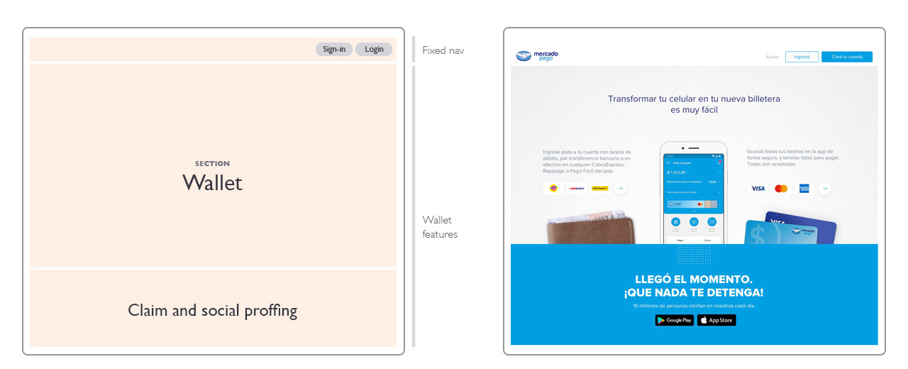
Last Section: Wallet /
Build a customized wallet where users can store their money and cards from other banks to pay easily and securely.
We achieved another key objective by demonstrating how users can fund their account with cash and add their cards for making payments.
About desktop version
-
We use the phone image and its surrounding animations to center the story and reinforce how the app functions as both your bank and wallet
Considering the amount of assets used to build this homepage, the main challenge was maintaining good performance. This aspect also affects SEO.
Preliminary results were very satisfactory—we were able to improve the Visual Progress time by 100% compared to the previous landing.
.
About mobile version
-
We worked hand in hand with development to review every constraint and carefully maintain the best experience across all breakpoints. The website was originally designed to deliver a "wow" experience on desktop while being optimized for smaller devices.